Think of Google as a living, breathing organism. It adjusts and adapts to how users are behaving. One of these game-changing adaptations is the move to mobile-first indexing. While Google is taking a slow and steady approach to rolling this new initiative out, it’s important to understand how this will affect your brand as it’s inevitable—mobile-first indexing will become the new norm.
What is mobile-first indexing?
The mention of Google’s mobile-first initiative has been around since 2016 which has slowly made its way to the headlines with its release. Google mentioned its goal of rolling out mobile-first indexing which means that over time, the mobile version of a website will be used as a baseline for ranking in the search results.
You’ve probably got a few questions, like:
Why?
Mobile use is at an all-time high. In the US, 94% of people with smartphones search for local information on their phones—and 77% of those searches happen at home or work near a desktop computer. Mobile search isn’t a trend that will stop any time soon. So Google is trying to move the internet in the right direction.
When?
Google announced the first instances of it would be rolled out on March 26, 2018, and stated the transition for sites would occur slowly to make sure they could deliver a good experience for website owners and users, based on how ready they were for the move.
“We evaluate each site individually on its readiness for mobile-first indexing based on the best practices and transition the site when the site is ready.” – Google
What does it mean for me?
Well, it all depends on how well you’re currently delivering a mobile experience. Google has a helpful tool that lets you know if you’re already in a good spot. But how you deliver your mobile site is pretty important in the long run.
The Different Mobile Experiences
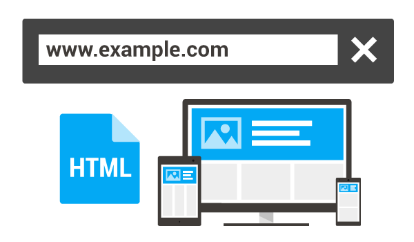
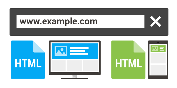
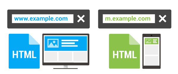
In general, there are 3 types of mobile website experiences. And the new standard takes that into consideration.

- Responsive sites — A responsive site is the best case scenario. Ideally, all the content should be available on any device, so the mobile and desktop experience should be the same. Any excluded content will reflect negatively on your site.

- Dynamically served website — If you’re serving up a different experience between desktop and mobile, you’re effectively doing double the work. That’s 2 versions of the site to maintain. And if you’re not keeping both versions of the sites up to date, that’s a hit against you. Whatever is available on mobile needs to be available on desktop.

- Separate mobile URL — With two completely different sites for mobile and desktop experiences, you’re going to do a lot of work. Everything—text, alt tags, videos, hreflang tags, —should all be mirrored on the mobile site and you should be serving similar content. Also, the mobile and desktop versions need to be mapped to each other. It’s important to note that Google only requires equivalent versions of metadata—not identical. An issue that we’ve already run into is relative tags. They need to be in order. The desktop site should not get clicks when someone is on mobile.
How to Know If You’re Ready
I mentioned above that you can check with Google’s tools, but the green check doesn’t necessarily mean you’re good to go in this case. Google is evaluating sites at their own pace, and they’ll notify you via Google Search Console if you’ve got it installed. If you have Search Console connected to your site, you should receive a message or email saying mobile-first indexing has been enabled.
What Will This Mean for the Future of SEO?
Well, SEO is always changing. So it’s another new standard to adhere to. Responsive sites need to keep serving mobile audiences the best way possible for mobile Those who are still using dynamic serving and separate mobile URLs need to make sure their houses are in order:
- Optimize and align title tags and meta descriptions. Again, metadata doesn’t need to be exact, but very alike.
- Make sure content is the same across both versions, even if it’s hidden in dynamically served sites.
- Make sure your headlines and content work for both mobile and desktop.
Here’s some other SEO issues that may come up if your site uses dynamic serving and separate mobile URLS:
- Pagination: If Googlebot can’t crawl past your first page, you may have some crawling and ranking issues.
- Structured data: The rich structured data on your desktop site needs to make its way to your mobile site. Google’s Structured Data Testing Tool can help.
- Hreflang tags: These need to point to the right places. For separate URLs, all desktop hreflang tags should go to desktop sites, and mobile hreflang tags to mobile sites.
- Robots.txt: If your site uses a desktop and mdot domain, make sure your Mobile and desktop sites both have the similar robot.txt rules.
- Crawl rate: If your site uses a desktop and mdot domain, you need to make sure your servers can handle extra traffic as Google will be crawling both versions of your site more and more.
- Alternate Tags: For sites that specifically serve users with separate URLs, Google recommends that you use alternate tagging to annotate your mobile URLs. For the best results, make sure your desktop URL includes an alternate tag pointing to the mobile URL and the mobile URL has the canonical tag pointing to the desktop version of the URL.
Ok, I Think I Have A Lot of Work To Do
The good news is that even the best estimates say that it’ll be a few years until Google has an index that’s totally mobile-first. That said, Google sent the memo out a while ago on this and it’s only a matter of time. Brands can either start pushing themselves in a more sustainable direction, or run the risk of being left behind.
For any sites that are using dynamic serving or separate mobile URLs, I strongly recommend moving to a fully responsive website. In the end, the amount of time and money spent maintaining two experiences will far outweigh the benefit of going responsive and iterating on the site’s performance over time.
Of course, we can always lend you a hand if you need it.


