
The passage of the Americans with Disabilities Act (ADA) in 1990 brought the challenges that people with disabilities face into the larger public consciousness. In the years following the law, improvements to physical structures throughout the country have increased access for all Americans to countless places that had previously been difficult or inaccessible.
While the ADA requires telecommunications to be made accessible to all persons covered under the act, and the subsequent 2009 expansion ensured that people could not be unintentionally excluded from protection—there still aren’t codified ADA compliance requirements for digital spaces. Even the 21st Century Communications and Video Accessibility Act of 2010 focused almost exclusively on telecoms and VoIP services.
This has lead to a wildly uneven experience for disabled persons on the internet. Designers and developers are becoming more aware of accessibility, but more often than not business priorities for web or app development take precedence over, and at times can unintentionally discriminate against, the needs of disabled folks. And that may have some unintended consequences for maximizing the potential return on investment in your website.
Considering the basics of accessibility
In my experience, conversations around web or app development often center on how best to serve the company’s target audience. This makes sense—your digital offering should be tailored to how your target audience behaves.
But what’s frequently pushed to the margins as a result are the needs of people within that audience that might have a hard time interacting with your content due to a disability. For instance, what if your corporate colors include red and green? If your audience skews male, there’s a high likelihood that a portion of your audience may be red-green colorblind. And they might have difficulty using color-based navigation or information hierarchy systems.
Access comes in different forms
With digital accessibility in mind, we start with considering the audience’s access to technology. Most companies that I have worked with know which devices and browsers that their traffic is coming from. If a significant portion of your audience is coming from mobile devices, there are different design and development choices to be made than if traffic is primarily from desktops. Likewise, if traffic is coming primarily from an outmoded browser, it may not make much sense to build in cutting-edge interactivity on the site, since it’s unlikely that they will load properly on the end user’s browser.
Designing with accessibility in mind
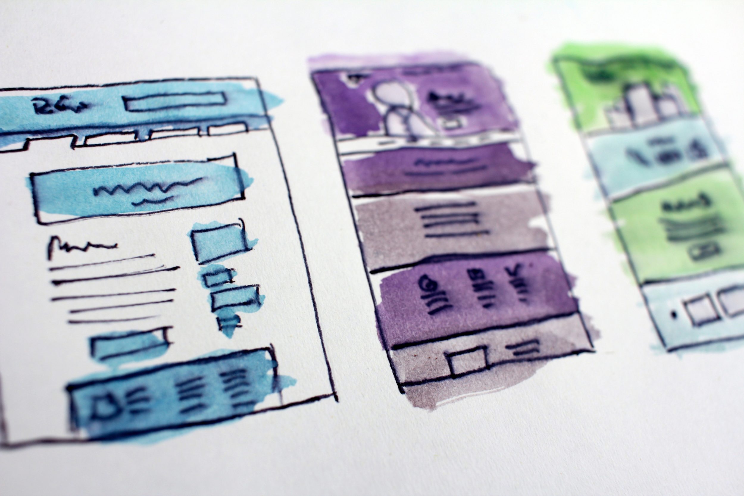
Conversations around how to make your website as accessible as possible can frequently get quite granular, down to intricate conversations on things like fonts, point size selection and kerning. These decisions may seem like inconsequential quibbling, but they can actually have a substantial impact on bounce and conversion rates, and your audience’s ability to find the information they’re looking for quickly.
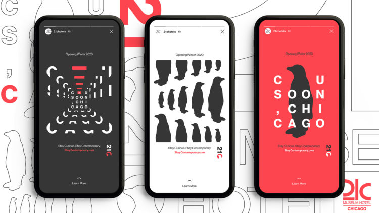
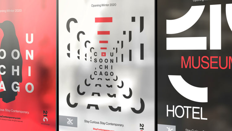
Chris Sorto, one of our resident expert designers, takes many of these things into consideration when designing a brand from the ground up. Check out some of the tools, tests and rules he uses:
Coolors.com
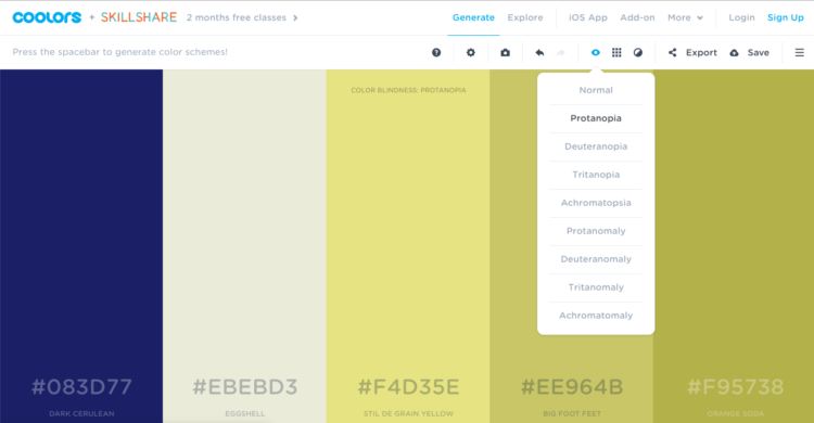
One of Chris’s first steps in design is to establish the color palette. High contrast makes things a lot more accessible all around. This site helps him see different colors in action, and even test for certain types of colorblindness. UI elements, like calls-to-action (CTAs) and interaction points, benefit from high contrast—otherwise they get lost on the page.
Colorable
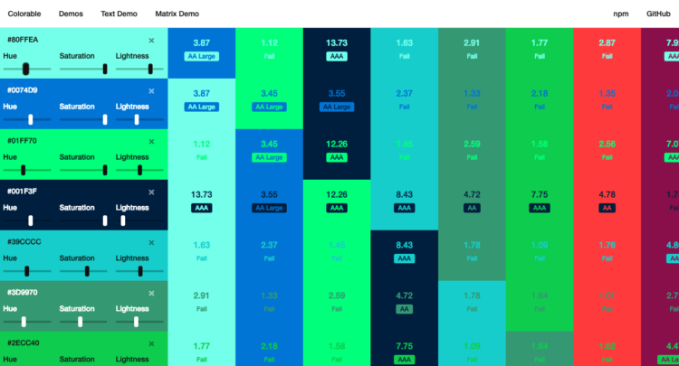
Chris tests his color palette in action here. You can see contrast in action, and make sure the shades and tones of your color palette work with each other—especially when considering type and background colors.
Font combinations
Knowing which fonts work well for big headlines and displays, and which are better for headlines or body copy is a well-respected skill for designers. Plus, Chris tests font choices in layout for legibility and web compatibility.
Bilingual sites
When a site needs to be in a few different languages, design and copy need to be thought of separately. A headline might be one line in English, but it could hit two or more in Spanish. Some languages work right to left, and that could affect all of the visual cues in a design, down to the architecture of the page. So ensuring that design doesn’t depend on copy is vital, but knowing which languages are at play is helpful, too.
If you’re looking to make big changes to your brand site, it’s important to keep the differently-abled in mind. Accounting for all potential users within your target audience is a great way to set your site up to be the most effective possible vehicle for conversion and growth.